Wednesday, April 30, 2014

Final Portfolio


Bohemia | Graphite and  Embroidery on Canvas | 2014

Detail


Spring Rain | Graphite, Pencil Crayon, and Fabric Embroidery on Canvas | 2014
Detail


Batik | Parsley and Padauk Dye on Bleached Muslin | 2014
Detail


The Golden Tribe | Turmeric Dye and Black Tea on Bleached Muslin | 2014
Detail


Dye Painting No. 1 | Synthetic Dye on Unbleached Muslin | 2014
Detail


Dye Painting No. 5 | Padauk Dye and Flower Print on Bleached Muslin | 2014
Detail


Dye Painting No. 6 | Synthetic Dye and Bleach on Bleached Muslin | 2014
Detail


Dye Painting No. 8 | Synthetic Dye and Bleach on Bleached Muslin | 2014
Detail


Dye Painting No. 10 | Synthetic Dye and Bleach on Bleached Muslin | 2014
Detail


Dye Painting No. 11 | Onionskin, Beet, Red Cabbage, Parsley, Turmeric, and Padauk Dye on Unbleached Muslin | 2014
Detail


Dye Painting No. 12 | Onionskin, Beet, Red Cabbage, Parsley, Turmeric, and Padauk Dye on Unbleached Muslin | 2014
Detail


Dye Painting No. 13 | Onionskin, Beet, Red Cabbage, Parsley, Turmeric, and Padauk Dye on Unbleached Muslin | 2014
Detail


Dye Painting No. 14 | Onionskin, Beet, Red Cabbage, Parsley, Turmeric, and Padauk Dye on Unbleached Muslin | 2014
Detail

Sunday, April 27, 2014

Materials Price List

Because I'm disorganised and hate receipts, and of course totally forgot we had to do this, I haven't kept track of exactly what I've spent money on for this class all that well.  I can tell you roughly how much I spent, but I'm not really sure how much each item was on its own, because I have this bad habit of picking up more things than I need every time I go into Hobby Lobby or Michael's.  This is also totally embarrassing because I have terrible will power, but not all of these supplies have been exhausted, at least.

$3.81 - Frame for Heraldry -
$16.48 - The Secret Language of Color book (sort of not for this class, but still relevant) +shipping -
$9.12 - Color: A Natural History of the Palette book (again, relevant) + shipping -
$15.40 - Gamboge Resin + shipping -
$20.80 - 6 yards of Muslin, 3 printed fat quarters, and trim used for Bohemia -
$19.00 - Canvases, some still unused -
$11.50 - 2 Gourds (couldn't get just one) + shipping
$18.75 - 1 yard custom printed cotton (tartan) + shipping
$10.34 - Quilting fat quarters
$8.32 - Window pane & tape for oil paint palette
$21.15 - Large canvas
$23.51 - Canvas boards & Scrapbook paper for character panels
$18.00 - Mason jars for storing homemade dyes, rubbing alcohol, vinegar
$25.00 - Fabric dye & storage containers
$20.00 - New art bin for my growing collection of supplies
$20.00 - Woodburning tool & nibs

+ about $40 at Hobby Lobby and Michaels that I can't account for, which was most likely spent on brushes, paint, canvas, etc.

Total: About $300

Artist Statement

My work is influenced by anthropology, science, and history, and focuses around origins. I have a constant urge to understand the world, and to communicate this knowledge, which is influenced largely by my early life. My father encouraged inquisitiveness and worldliness, and my mother encouraged creativity and expression. The research I do is fundamental to my work, and many times is the search for a story. The stories I uncover about the materials or processes I choose often become the basis of a piece.  My current work reflects research of folk art, cultural textile art, and the geographical, chemical, and geological origin of colour.  Folk art, ritual and tradition possess narrative qualities that appeal to me. I also enjoy telling my own stories and am interested in how a portrait can convey the story of a person.

Friday, April 25, 2014

Final Response: Art & Fear

1. What work have you made that seems most yours? Why?

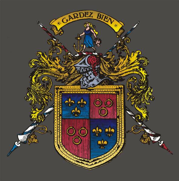
The work that seems most mine is the work that is the work that is rooted within my own personal history.  In the context of this class, the tartan is the most familiar to me and the most personal, and therefore feels the most mine.  In fact, even compared to work I've done before and outside of this class, I would still provide the same answer.  Interestingly, even though most of the work I've done this semester is portraits, the portraits don't necessarily give me that feeling of ownership or familiarity, because to me they're just as much about the woman in the portrait (often an ambiguous, fictitious character) as they are about me, if not more so.

2. Who are artists that are making work that relates to you? Are there other influences? How are these other influences connected to your work?

I have not identified any artists by name who are producing work that I really relate to, even after gathering weekly inspiration related to my work.  I often just see art or design during the course of the day that I think are interesting, or I browse Pinterest and put together a collection of various artists, some without attribution.  Other than what's on the blog already, there is no particular artist now that really influences what I create. 
There are other influences though, including the authors of the two colour books I obtained this semester, which are mentioned earlier in the blog.  They are Color: A Natural History of the Palette by Victoria Finlay, and The Secret Language of Color by Joann and Arielle Eckstut.  Science and research has become, especially over the semester, very integral to my work.  Actually just an hour or so ago I was watching a BBC series by Dominic Monaghan called Wild Things, in which he travels the world looking for interesting creatures.  In this episode he traveled to the Amazon, and in one of the villages he visited, the children had their faces painted with paste made from the seeds of the Achiote fruit (from a plant that is also nicknamed the lipstick tree).  This paste is a vibrant red-orange and is used as warpaint or as a deterrent to illness, and clearly has some superstition surrounding it.  I find this fascinating, and I would love to get my hands on some of this material to produce a piece that tells its story and the story of the people who have adopted it into their culture. 

3. "And while a hundred civilizations have prospered (sometimes for centuries) without computers or windmills or even the wheel, none have survived even a few generations without art" p. 104.  Why do you think this is so?

Now that I'm researching the history of colours, particularly, I'm finding that a lot of naturally occurring vibrant pigments had an element of ritual attached to them, at least originally, if not to this day.  I don't know that they were necessarily originally for art so much as they were for the ceremonial, for the ritual, for superstition, or religion, but because of their significance in these facets of society, the same colours then became important in the art of these cultures.  The art itself sometimes even has this same association.  It is part of ritual, or it is meant to communicate ritual or cultural significance, or something that makes a particular culture distinct from another.  Technology is a tool, a means to accomplish something beyond itself.  Art seems to have originated from a desire to identify, to imply that something or someone is unique.  I think it's integral to the meaning we give to life and to our own identities as groups of people and, even more today, as individuals.

4. "Art is something you do out in the world, or something you do about the world, or even something you do for the world.  The need to make art may not stem solely from the need to express who you are, but from a need to complete a relationship with something outside of yourself." p. 108.  Which of these ideas resonates most with you? Why? If they all resonate, how do they differ?

Art seems to be all of these things.  You do art in the world to distinguish yourself from the others making art.  You do art about the world to express your relationship with your environment and with your audience.  You do art for the world to communicate a combination of these ideas.  While I believe that part of the purpose of art is to distinguish identity, I think art that expresses who you are is irrelevant if it does not address some kind of relationship to something outside of yourself, whether it's the viewer, the world at large, or your environment; this is partially because who you are is a combination of these things.

5. What do you notice about yourself? What are your methods? Subject matter? The answers do not have to be limited to art related topics.

I think I had been trying to get away from things that looked natural, especially toward the end of last semester when I adopted an aesthetic in graphic design that is characterised by large areas of white space, plenty of cool colours, the use of geometric shapes, and a very clean, angular, futuristic and sleek feel.  Through my art this semester though, I wouldn't say I've gone in the opposite direction, because my work retains some of these qualities, but I have definitely embraced a more natural feel.  This is particularly evident through my use of unbleached muslin and plant dyes, but also through the stories I've chosen to tell, and even in the way I branded myself, which was partially relevant to this class.  So I'm definitely drawn to the elegance of natural materials (right now I'm obsessed with bamboo).  My methods have gone from finding inspiration in the world and expressing it through the materials to just letting the materials determine the outcome.  I developed almost a ritualistic process for creating the dye paintings, which involved repetitive actions and repetitive shapes, typically starting each piece in the same way and not even really being very consciously aware of the compositional choices I was making at the time.  I have learned fairly well how to control the medium, but it has also taught me to embrace the accidents that quite frequently happen in working this way.

6. What do you care about? The answers do not have to be limited to art related topics.

I care about history and about science, and about using my artistic practise as both a tool and as a method of expression that furthers and communicates my understanding of the world.  Origins are something I pinpointed a while ago as the one thing that I'm most interested in, and it's proving more and more true.  It means becoming conscious of objects and phenomena and materials I come across with in my everyday life (or not) and having the curiosity and the initiative to research what makes them the way they are.  The fantastic thing is, even when you know, for example, that the green dye made from parsley is the result of the extraction of chlorophyll from the plant, and that the purpose of chlorophyll is to photosynthesise sustenance for the plant, and that the reason it's green is so that it absorbs several other colours of light, you still don't know WHY.  There is always a mystery, even at the bottom of things.  I love digging as far down as I can go and still being astounded that these mechanisms exist in our world.  I've become particularly interested in colour, I think, because not only does it provide extremely relevant scientific ground in the field of art, the science of colour explains so many things in our world.  As one of the first pages in The Secret Language of Color states, to be an expert in colour, you would have to be an astrophysicist and a biologist and a geologist and an anthropologist and a psychologist and a historian and an artist and a botanist... and even then you wouldn't be an expert.  It's such a broad and endless topic, and I find it truly fascinating.

Week 14 Inspiration

This is the image I traced of my family crest; the artist is unknown, but there are several renditions of this floating around the internet and this one happens to be my favourite.
I actually came across this image a good year or so ago, because this is something I'm thinking about possible adapting into a tattoo. 

I was having trouble shading my figure's skin in my portrait, so I started looking around for some examples.  I like how this painter treated the background, too. This is by a Russian painter named Vladimir Volegov.


 I also found this painted silk scarf and think I would like to try doing something like this, if I can ever get my hands on 100% silk.  I had thought about using the material, but I like the line quality and colour treatment on this piece, too.

Week 14 Work

One new piece I started, inspired by painting tartan:

This is pencil on tracing paper, traced from an image I found online of my family crest (top) and coat of arms (bottom) with some cool embellishments.  The plan is to trace it in pen on a separate layer of tracing paper and to possibly add some kind of coloured layer, possibly even dyed fabric, and then display it in a square frame.

This week, however, has mostly been about getting everything finished up for submission to the gallery, so I'm still working on finishing the large portrait:

I just have a bit of skin left, some highlights on the table, and her hair.  This week I repainted sections of the "environment" out the window, finished the plaid, repainted the chairs, and started to go over her skin.

Tuesday, April 22, 2014

Juried Show Application

I have submitted the following pieces to the Light Space & Time Online Gallery's "Figurative" themed juried exhibition:

Dye Painting No. 1

Dye Painting No. 8

Dye Painting No. 10

Dye Painting No. 6

Dye Painting No. 14

Friday, April 18, 2014

Week 13 Work

I spent a lot of time on detail this week, realising that a few of the more intensive pieces I've been working on need to be finished up a week from now.  Although I didn't actually explore anything new, the delicate and tedious nature of painting tartan onto a garment sparked ideas for another painting in the future, and working on my gourd allowed me to become more familiar with various woodburning tools and techniques.
Working on both of these pieces involved very tedious and time consuming processes, which was a real exercise in patience.


Week 13 Inspiration

This particular source is not particularly relevant to any of my work this week, but something I think applies to all of the portraits I have done.  I was exposed to her work before even beginning this body of work and hadn't really thought about the similarity of her work to mine in the importance of narrative. I had kind of forgotten about her work until her latest photo was released this week.
Kristy Mitchell creates fantastical and powerful female characters for her spectacular staged photoshoots.  She has a background in costume design, and creates her models' larger-than-life costumes, wigs, and props from scratch.  Each final photo is the result of months of work on one costume, one set up, one story, and one long photoshoot. In each photo, Mitchell tells a story inspired by the fairytales her late mother read to her as a child.  The project, which has spanned 5 years now, began as a memorial for her mother.

Here are some pieces from this large series that I am particularly drawn to:

"Gammelyn's Daughter A Waking Dream"
"The Queen's Armada"
"The Last Dance Of The Flowers"
"I'll Wait For You In The Shadows Of Summer"

Because I'm working more on the gourd I started this week, I'm also looking at how portraits are typically represented in traditional Inca art.  Mine will probably better reflect my own figure drawing style, but references are helpful.

Mariano Flores Kananga (Quechua, ca. 1850-1949), carved gourd ca. 1925
I have also been painting the tartan into my larger painting this week and have been thinking about how it sits, how it's woven, and what it would be like for the tartan I designed to actually be produced.  This got me wondering about the process of making one, and a scene for a new painting started to form in my head.  The scene would be very detailed, and right now that's actually quite a painful thought, but the origin story behind the image greatly appeals to me.  Of course, this work would have to be independent, as there's no way I could complete this during this semester.  But even with the work I have been doing with other materials, I still find comfort in figurative oil painting.
Here are some images I found that are helping me solidify the scene I'm seeing in my head:

A loom at DC Dagliesh, one of the big names in modern tartan weaving

Friday, April 11, 2014

Week 12 Inspiration


What's funny is I found this book that explains how to make dyes and use fixatives and the process of dyeing fabric, which is from the 30's, and I didn't even think about it when I decided on the style and layout for that sketch I did of the vegetables and the chemical structures of their pigments.  The connection is definitely there, though.


Lia Melia, United Kingdom, "Hers", mixed media
I believe this is done with paints, but the way the colours run together reminds me of working with dye.  Just as an experiment in technique, I might try to replicate this painting with dyes on fabric to see what I can do .


I wanted to do something like this with the flower bundle so that it would be more of a textile piece and less just a demonstration of dye methods.  However, since the colour didn't work out, I'll have to hold off on this until I can find another way to produce the colour.  I'm tentative to just immerse it in either natural or synthetic dyes because I wanted the finished piece to reflect the process of making it, and I thought a flower-stitch or some kind of representation of the flower petals themselves would be fitting for a piece dyed with the colour produced by the flowers.


For anyone who hasn't already had me shove this book into their hands or faces and go on and on about how interesting it is, I ordered this book and it's really interesting and I love it and I love her and I love the idea of what she's doing.  Even the cover is inspiring.  I'm still only in the first chapter, in which Victoria recounts her travels through northern Australia, where she went to learn about the natural source of ochre, the types of ochre, the cultural uses for ochre and the sacredness surrounding ochre, particularly the colour red.  I am interested in the science of colour, but I like this book because while it might talk about that very briefly, it reads more like an ethnography, because Finlay is, after all, a social anthropologist.  I could not communicate how this could not possibly be any more up my alley.  Not only do you learn about the colour itself but what it might mean to different people, and maybe even what your own use of it might signify.  I'm very excited to get to the part about gamboge. 

Speaking of gamboge:


It's hard to distinguish because of the brightness of the image overall, but the darker area on the right of this tiny fragment of gamboge resin is darker not only because it is in shadow.  That orange-brown is actually the natural colour of gamboge in its solid, dry state.  The bright colour you see on the left, and yes, it really is that bright, is the "perfect yellow" that is the result of adding a drop of water to the resin.  The way the story was told on Radiolab, by, as it happens, Victoria Finlay, was so celebrated and mythical that the experience for me of acquiring my own little chunk of gamboge and performing this act of dripping a little water on it was basically ceremonial.  The plan for the painting of which this resin will be a part is basically to retell the story they told on Radiolab visually alongside the story that is being told through words.