I found it interesting how Thomas Cooper has one foot in contemporary, almost conceptual art, and one foot planted very firmly in the historical practices of the craft of photography, combined with the even older histories of the places and narratives he chooses to research and photograph.
I chose this essay based on the title. The only information the title really gives is that inspiration can be drawn from history, geography, sensuality, and cosmology. I felt very drawn to this immediately, which by now should be no surprise, as there is an obvious historical influence in my work as well. You could even say there is a geographical influence; although I am not traveling to make my work, the history I'm currently drawing from is very geographically ingrained.
I thought Cooper's photographs were elevated to a higher rank of integrity by his process; how he will research a location thoroughly before traveling, but will only travel with one roll of film, does not use metering equipment to ensure a properly exposed shot, and will even only take a single shot once he gets there. I was in awe of this, because his images are photographically beautiful independent of the subject matter, and he must have incredible confidence in his craft and his judgement to be able to do this.
I twinged a little, too, when I read this though. I felt myself slightly concerned for him, because he explained in the interview that it took him a long time to be able to financially justify his approach to travel photography. He also explained he has a young family to support, and yet he spends thousands of dollars in transportation, rent, and labour just to produce a single photograph. This one shot he takes on any given trip, I assume, turns out well more times than it doesn't. But to me there is so much risk involved in only taking only one shot, in not even glancing at the light meter for reassurance, and then leaving that location, and deciding that if the shot wasn't right, there would be no photograph from that location. This single-shot approach to photography is one of the few forms of generating art I can think of that produces a piece that can't be redone, that can't be further worked into if it's not right. A painting can be painted over, pieces of digital art can be deleted or retraced, stitches can be ripped out and resewn, and even some sculptures can be added to or taken away from to repair them or drive them in a new direction. But if you're only taking one shot, there isn't much you can do after that shutter closes.
Friday, January 31, 2014
Week 2 Inspiration & Research
 |
| I took this photograph in Scotland in 2008. This was my main reference for the thistle print. |
 |
| I normally don't colour in this slightly offset way, leaving parts of a drawing unfilled, or painting with very loose, impressionist strokes, but I wanted to do something light and loose for the thistle, something that compromised the thistle's harsh, thorny exterior with a very feminine, decorative aesthetic. |
Thursday, January 30, 2014
Week 2 Work
This week I decided to focus more on tartan design after some of the feedback in class on my work for week one. My focus right now is on a Montgomery dress tartan, which is something on which I had begun work as long ago as this past summer but with which I am not yet satisfied. Here is the original tartan:

Here are the designs I'd already done:


I noticed in looking at other tartans and in designing them myself that multiple thinner lines are more elegant than large sections of colour, and that even though high contrast is awesome, colours have a lot more depth if they are gradated into one another. For example, I explore this a lot in that very last version, bringing in lighter and lighter complements of the dark red, green, and blue- pink, light green, and baby blue- to soften the edges of these colours. In a true dress tartan, the base (the section of the largest colour) is typically white, which is a step I didn't take until the most recent version because the original version of my tartan has a very dark base. The challenge is to create an elegant dress tartan that showcases the original colours and check without deviating too far from the original.
Here is my progress from this week:


This last one is not the complete tartan--you'll notice it lacks the red, but I kept it anyway because I thought this combination of blues and greens worked really well. I think it needs some adjustment regarding thread count though, because that green is really bright, but the colours are what interested me.
I also worked some more on some of the art prints I had drawn elements for last week. Here is the scroll piece from my drawing, traced and tiled, in two different colours. I also uploaded them to Spoonflower, one of the websites where you can upload your designs and order them on fabric, to make sure that it tiled properly, and it looked fantastic!


Here is another one:

Here are the designs I'd already done:
I noticed in looking at other tartans and in designing them myself that multiple thinner lines are more elegant than large sections of colour, and that even though high contrast is awesome, colours have a lot more depth if they are gradated into one another. For example, I explore this a lot in that very last version, bringing in lighter and lighter complements of the dark red, green, and blue- pink, light green, and baby blue- to soften the edges of these colours. In a true dress tartan, the base (the section of the largest colour) is typically white, which is a step I didn't take until the most recent version because the original version of my tartan has a very dark base. The challenge is to create an elegant dress tartan that showcases the original colours and check without deviating too far from the original.
Here is my progress from this week:
This last one is not the complete tartan--you'll notice it lacks the red, but I kept it anyway because I thought this combination of blues and greens worked really well. I think it needs some adjustment regarding thread count though, because that green is really bright, but the colours are what interested me.
I also worked some more on some of the art prints I had drawn elements for last week. Here is the scroll piece from my drawing, traced and tiled, in two different colours. I also uploaded them to Spoonflower, one of the websites where you can upload your designs and order them on fabric, to make sure that it tiled properly, and it looked fantastic!
Here is another one:
Week 1 Reading - Art & Fear
1. What work have you made that seems most yours? Why?
I think the work that seems most mine is work I have done for others. Either a friend will ask me to paint/draw/design something for him/her, or I start something with the intent to give it to someone in particular. From that point on, even though the subject matter itself usually relates more to the person for whom I am doing the work, there is something about doing the work for someone else that seems to relate more to myself than doing work just for me. I think it may be the awareness that this person has recognized me as an artist and has come to me with a request to do my work for them. When I am working for myself, I am only subconsciously aware of being an artist because it's something I have been all my life. A lot of the time, as they mention in the book, work you make for yourself is really only practise. Something you do for someone else, whether or not you value it as a finished piece or as practise, will always be viewed as an example of your finished work by the person you give it to.
2. Who are artists that are making work that relates to you? Are there other influences? How are these other influences connected to your work?
Thomas Sailot is a painter I've been keeping my eye on ever since I had to choose a master painter to copy for painting class. Although I haven't painted much since then, I've been seeing updates of his work. I think it's hard for me to find artists who produce work that I consistently love. They may be great artists, and I may be attracted to some of their work, but some things they produce just don't resonate with me personally. This makes sense, since this happens even with my own work. Of course I strive to make stuff I'm in love with, but there's the occasional total miss. Sailot, although there is, every once in a while, a piece I don't like, produces work I love a lot more consistently than any other artist I know by name (although there really aren't many I know by name). A lot of time I feel that he paints the sort of thing I would like to paint (and after doing the master copy of his piece "Bored Stiff", I know that I DO enjoy painting the sort of thing he paints).
As a graphic designer, of course there is so much work out there that I love and wish I had made and from which I draw inspiration for my own work. When you see their work as part of a personal profile, their name is associated with it, but unless you're specifically researching and browsing the work of other designers, you usually don't see it this way. Primarily, graphic design work appears out in the real, wider world, outside the bubble of graphic designers interacting with each other. Websites, food labels, business storefronts, magazines, billboards--all these things are designed. But in these instances, the designer's name is not attached to the final product. Unless you follow a designer or a project very closely, you probably have no idea who made most of what you see.
Other influences that I can identify are usually peers or acquaintances. These are people who are my friends, but who often also seem like competitors. Sometimes they truly are competitors. It's usually not a good thing to compare yourself to other artists because everyone has a unique set of circumstances that led to the specific work he or she makes, and your circumstances are never going to be the same. But sometimes this can be a fantastic source of personal drive. To work harder. To make more. To try a different aesthetic. To acquire a new skill. While sometimes this drive comes from what is, for me, a bit of a negative place, accompanied by the realization that I'm not doing enough or that my skill isn't where it should be, or that I don't like anything I've made, or that maybe I shouldn't have even gone into this field, it usually results in a more positive sense of accomplishment after I've pushed myself to fix the problem that caused the doubt.
One of my specific influences recently is a girl I went to high school with but didn't know well. She was sort of THE art girl, someone I looked up to because I wished I could be that widely recognized for what I do, someone I was maybe a little envious of. She went to SCAD for textiles and recently graduated, then designed a print for Lily Pulitzer that went into production. It was then that I seriously revisited the idea of designing print fabrics myself, just before starting BA.
3. "And while a hundred civilizations have prospered (sometimes for centuries) without computers or windmills or even the wheel, none have survived even a few generations without art" p. 104. Why do you think this is so?
This is a difficult question to answer for someone who has just sort of intuitively always had a need and/or a desire to make art. I can't tell if I'm different from the general population because of this, or if this is an intrinsic impulse that everyone has. If it's the latter, then that probably answers the question. I also think it's easier to visually emulate or imitate your surroundings than it is to generate completely new ideas or innovate new technologies, so maybe this is why art came first.
4. "Art is something you do out in the world, or something you do about the world, or even something you do for the world. The need to make art may not stem solely from the need to express who you are, but from a need to complete a relationship with something outside of yourself." p. 108. Which of these ideas resonates most with you? Why? If they all resonate, how do they differ?
A lot of my personal projects come from a feeling or a set of feelings I have regarding myself in relation to the world, often a struggle to define myself within it. This would be the generation of art in response to the need to express who I am, but who I am means nothing independently of my relationship to the outside world. Therefore, this is art made about the world. As a graphic designer, however, the nature of my work is to make something for the world. It is to add pieces to the built world that other people will interact with. Especially because, as I explained in my answer to number 2, a lot of design work becomes sort of separated by its designer and most people don't know who designed what, I consider this work to be for the world because I will most likely be separated from it. I think where these ideas differ is just how much of the self is involved in the need to make a particular piece, or how personal the piece is. When a piece comes from a very personal struggle, it is much less for the world and more about the world or the artist's interaction with the world. When a piece is less personal, it may be much more for the world and much less or maybe not at all about the interaction.
5. What do you notice about yourself? What are your methods? Subject matter? The answers do not have to be limited to art related topics.
Everything I make sort of has this look to me... Even when I make several things that all fit into completely different aesthetics, all my work looks the same. To me, it looks like I made it. I can't really describe it... it's as if everything I make still seems a little bit messy, even when it's in the cleanest, most minimalist aesthetic. Most things I make tend to have a slight historical edge, whether it's a pattern, the colours, the name, the shape.
A lot of the time, I feel like my process for generating work is in the wrong order. Sometimes I have a picture in my head, instantly, finished, before I even start, or before I've even considered making a piece of art, but the image is vague enough that it is often still very difficult to get the piece right, and most of the time it never actually gets there but turns into something else entirely. They talked about this in the book, too, on pages 15-17, so of course it's perfectly normal.
In fine art, the problem with this approach is as they explain it, that when working with the materials, it can be difficult to retain the idea you had in your head before you started and to get the piece to come to life. In graphic design, though, this approach sometimes means forgoing the research phase, or being too committed to an idea to realize that it may not be the best solution for the client. Similarly, choosing a colour palette before designing a logo might not be the best approach either, because once a client sees your logo in one colour palette, they assume that's final, when really it's quite easy to change it to a variety of colours depending on what they want. But most of the time, I choose colours first. Maybe these habits can be good, maybe they will prove to be intuitive. Maybe they're bad though, and hopefully, if they are, I'll break them as I gain experience actually working with clients.
Subject matter varies by what's requested of me because this is the first time in a while that I've had a choice in what I make. I like portraits a lot though, and actually, right in between reading the last page of the book and starting to write my answers to these questions, I had one of those visions in my head I was talking about for a next painting, so I sketched it out really quick to make sure I could get it to work. Again, it's sort of a self-reflexive piece. The projects I am working on for BA, patternmaking, draw from more abstracted and cultural subject matter, which is a place I always go back to when I'm not sure what to do about content.
6. What do you care about? The answers do not have to be limited to art related topics.
I care about my heritage, which as I said provides a decent amount of content. This is an interest that has been engrained in my throughout my upbringing by other members of my family.
I care a lot about the opinions other people generate about me when they see my work; sometimes this is bad, because thinking about other people can be a hindrance or just because it can make me pretty anxious about my own work, but most of the time it's advantageous to keep in the back of my mind the entire time I'm working because it sets my quality standard even higher.
I care about taking breaks, having time to myself, and enjoying working rather than stressing myself out by working 24/7. In some respects I'm a bit ashamed of this, because I could probably be a much better artist, student, etc. if I were willing to put more time into it. Mostly this shame comes from comparisons with other, much harder working artists though, who are sort of anomalies regarding how committed they are. This is an easy thing to change though, should I wish to.
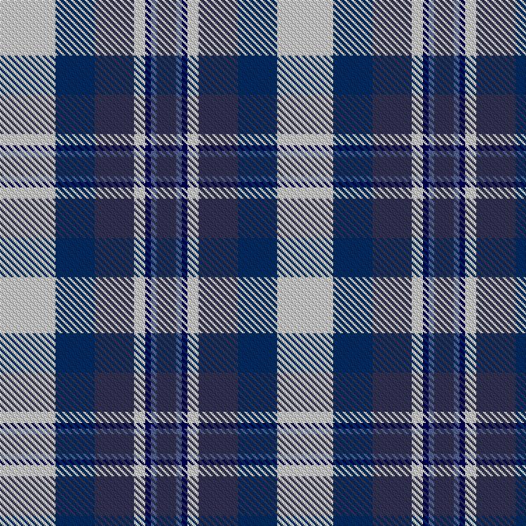
Wednesday, January 29, 2014
Mad About Plaid: A Crash Course in Tartan Terminology
Jumping off of what was said during the in-class critique about potentially having the Montgomery tartan that I designed printed and bringing more heritage into my work, I decided to work more on tartan design this week. Although I have played with designing generic tartans, perfecting the Montgomery Dress design is pretty important to me and I'm not quite satisfied yet. I've worked on it significantly before this class too. Examples of previous work on this project is in the next post, Week 2 Work.
This post is all about what a tartan is and how they're classified. There is a lot of terminology associated with tartan design, most of which I've picked up just from my experience as a consumer with an industry that deals very directly with them, some of which I've researched for the purposes of designing.
Supposedly, the term tartan is most likely derived from the French word tiertain, from the verb tirer which means to draw and references woven cloth, and from the Gaelic braecan, a term used to describe patterned cloth with many colours. Over time these may have combined into the word tartan. The term plaid is largely an American classification of the generic pattern of any given tartan. In Scottish culture, plaid is usually a noun, not an adjective, that refers to either the length of fabric worn over the shoulder or tartan cloth that is not meant to be worn, like a blanket or a tablecloth. The term tartan may refer to the style of pattern, but usually it is used to describe any specific check pattern used to identify a clan or society. Most clans (family groups) have several tartans or several versions of the same tartan. Sometimes even regional sects (smaller groups from different places) of a clan have tartans that are different from each other. One small square section of any tartan pattern is called a sett, hence the title of this blog. This is more important for weavers, because the threadcount of each colour and the total threadcount of a tartan is listed per sett, not for the entire woven piece.
Different terms used to describe a tartan, although they would seem to describe the time period or the activity for which the tartan was/is worn, are really only references to its colour palette.
Dress doesn't mean that this variation of the tartan is meant to be any more formal than the others, but simply that the tartan includes large areas of white.
A Hunting Tartan usually uses more natural and muted tones of earthy colours like blue, green, and brown.
An Ancient Tartan uses light, muted colours that appear to have aged over time, even though the tartan may have been designed recently. These colours are typically generated, or are designed to look as if they are generated, by natural dyes.
A Modern Tartan is coloured with chemical dye, which means that it can include much brighter colours than a tartan made by natural dyes. Arguably, these tartans may be considered less traditional.
Fashion tartans are not associated with clans. They are usually designed for just that--fashion. However, in the Highland Dancing world in particular, there are several fashion tartans that are derived from actual clan tartans. These may imitate the existing check of a clan tartan but colourise the sett. A lot of them use really bright colours. Most recently, they have started to venture away from the typical reds, royal blues, deep greens, and purples, and are now available in turquoise blue, fuschia, and lime green, which are not very traditional colours.
A tartan can be more than one of these things at once, where the definitions do not contradict each other. For example, a tartan can be a modern and a dress, an ancient and a dress, a dress and a fashion, or a fashion and a hunting, and so on.
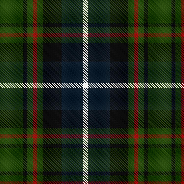
Here are some examples using the many tartans of the MacRae Clan to show how these different terms apply.
1) Standard MacRae tartan (there may be more than one standard but this is just the first one I found):

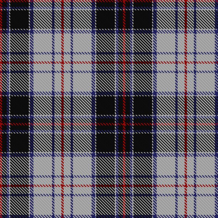
2) The MacRae Hunting Tartan
3) Two Regional variations of the clan tartan: MacRae of Ardentoul and MacRae of Conchra
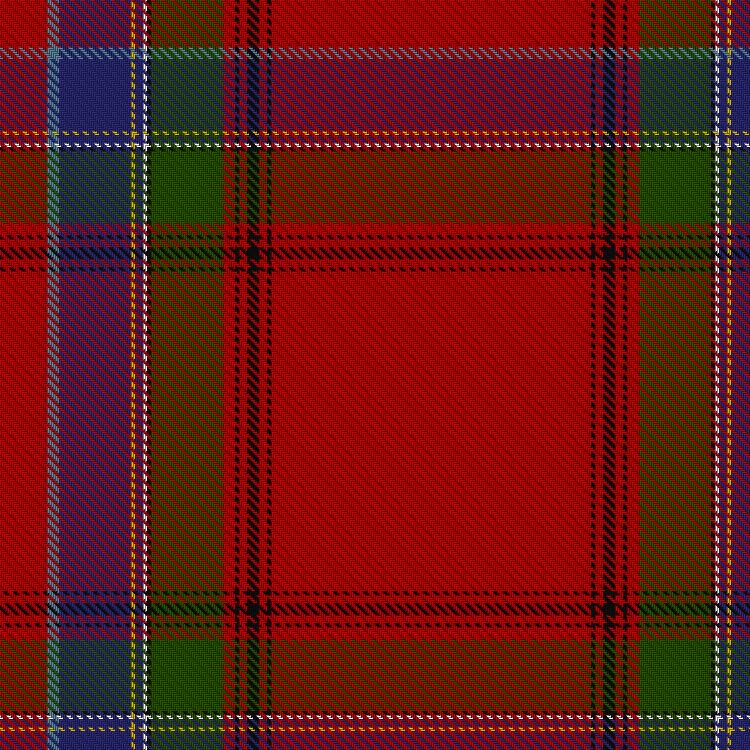

4) Dress MacRae (the black colour variation is also sometimes referred to as Dress Scott, red is the dominant colour in the non-dress versions as well except for Hunting)

5) Dress Red Ancient MacRae (this is a more recently designed variation, but uses colours that are meant to look as if they have faded from the standard bright red)

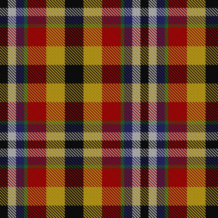
6) Fashion Dress MacRae in purple, blue, royal blue (the difference between the two blues being the colour of the other stripes), teal, the previously featured red, a darker shade of red referred to as wine, and the newer ones, turquoise, fuschia and BRAND NEW! lime green (these are pretty much all designed specifically for dance kilts)


This post is all about what a tartan is and how they're classified. There is a lot of terminology associated with tartan design, most of which I've picked up just from my experience as a consumer with an industry that deals very directly with them, some of which I've researched for the purposes of designing.
Supposedly, the term tartan is most likely derived from the French word tiertain, from the verb tirer which means to draw and references woven cloth, and from the Gaelic braecan, a term used to describe patterned cloth with many colours. Over time these may have combined into the word tartan. The term plaid is largely an American classification of the generic pattern of any given tartan. In Scottish culture, plaid is usually a noun, not an adjective, that refers to either the length of fabric worn over the shoulder or tartan cloth that is not meant to be worn, like a blanket or a tablecloth. The term tartan may refer to the style of pattern, but usually it is used to describe any specific check pattern used to identify a clan or society. Most clans (family groups) have several tartans or several versions of the same tartan. Sometimes even regional sects (smaller groups from different places) of a clan have tartans that are different from each other. One small square section of any tartan pattern is called a sett, hence the title of this blog. This is more important for weavers, because the threadcount of each colour and the total threadcount of a tartan is listed per sett, not for the entire woven piece.
Different terms used to describe a tartan, although they would seem to describe the time period or the activity for which the tartan was/is worn, are really only references to its colour palette.
Dress doesn't mean that this variation of the tartan is meant to be any more formal than the others, but simply that the tartan includes large areas of white.
A Hunting Tartan usually uses more natural and muted tones of earthy colours like blue, green, and brown.
An Ancient Tartan uses light, muted colours that appear to have aged over time, even though the tartan may have been designed recently. These colours are typically generated, or are designed to look as if they are generated, by natural dyes.
A Modern Tartan is coloured with chemical dye, which means that it can include much brighter colours than a tartan made by natural dyes. Arguably, these tartans may be considered less traditional.
Fashion tartans are not associated with clans. They are usually designed for just that--fashion. However, in the Highland Dancing world in particular, there are several fashion tartans that are derived from actual clan tartans. These may imitate the existing check of a clan tartan but colourise the sett. A lot of them use really bright colours. Most recently, they have started to venture away from the typical reds, royal blues, deep greens, and purples, and are now available in turquoise blue, fuschia, and lime green, which are not very traditional colours.
A tartan can be more than one of these things at once, where the definitions do not contradict each other. For example, a tartan can be a modern and a dress, an ancient and a dress, a dress and a fashion, or a fashion and a hunting, and so on.
Here are some examples using the many tartans of the MacRae Clan to show how these different terms apply.
1) Standard MacRae tartan (there may be more than one standard but this is just the first one I found):
2) The MacRae Hunting Tartan
3) Two Regional variations of the clan tartan: MacRae of Ardentoul and MacRae of Conchra
5) Dress Red Ancient MacRae (this is a more recently designed variation, but uses colours that are meant to look as if they have faded from the standard bright red)
6) Fashion Dress MacRae in purple, blue, royal blue (the difference between the two blues being the colour of the other stripes), teal, the previously featured red, a darker shade of red referred to as wine, and the newer ones, turquoise, fuschia and BRAND NEW! lime green (these are pretty much all designed specifically for dance kilts)
(Unfortunately I can't find a good picture of the regular blue dress. Below is the Dress Royal Blue. The difference is the yellow stripe - in the regular blue, the stripes are teal and purple instead of yellow and white.)
(I also can't find the super fun bright turquoise and fuschia in swatches, sorry. But here's lime!)
Friday, January 24, 2014
Week 1 Work
I started to experiment with basic shapes digitally, thinking about how the design would be tiled when it would be set up to print on fabric:

I also began an attempt to build a tartan digitally without the aid of weaving software (It's still in a very basic stage):

Tartans are something I have become familiar with through my heritage but building them is something I have little experience with. I also built one digitally using weaving software to experiment with some colours and line quality:

Although these exercises kept to very geometric, simple, and digitally generated shapes, I am also very drawn to floral and scrollwork prints and would like to design some patterns in those styles. I began sketching natural elements by hand on a drawing pad and plan on tracing them digitally as vectors and applying colour digitally:

I also began an attempt to build a tartan digitally without the aid of weaving software (It's still in a very basic stage):
Tartans are something I have become familiar with through my heritage but building them is something I have little experience with. I also built one digitally using weaving software to experiment with some colours and line quality:
Although these exercises kept to very geometric, simple, and digitally generated shapes, I am also very drawn to floral and scrollwork prints and would like to design some patterns in those styles. I began sketching natural elements by hand on a drawing pad and plan on tracing them digitally as vectors and applying colour digitally:
Week 1 Inspiration & Research
I began with the idea that maybe I would design textiles, so I started gathering examples of textile designs that I liked. I am most interested in more historical patterns but would like to add a personal and modern touch to these elements in my designs. Here are a few examples of designs I looked most closely at while starting my floral elements drawing sheet:


As a reference for tartans, here are some I DO like versus some I DON'T like. To many people who have not had much exposure to a wide range of tartans and plaids, a lot of them start to look the same or there seem to be little grounds on which to choose a favourite tartan. I'll start with some I don't like:
(For the record, when a tartan name has the word "Dress" in it, it usually indicates that the tartan has a white base. I tend to gravitate toward these mostly because of my history as a dancer, but also because of the contrast between light and dark.)
MacFie (Sorry, MacFie's out there)
.png)


Dress Green Drummond of Perth (this one actually fits the reverse of what I described, with the darker colour in the middle of the check, but it still has the same illusion of depth):


As a reference for tartans, here are some I DO like versus some I DON'T like. To many people who have not had much exposure to a wide range of tartans and plaids, a lot of them start to look the same or there seem to be little grounds on which to choose a favourite tartan. I'll start with some I don't like:
(For the record, when a tartan name has the word "Dress" in it, it usually indicates that the tartan has a white base. I tend to gravitate toward these mostly because of my history as a dancer, but also because of the contrast between light and dark.)
MacFie (Sorry, MacFie's out there)
Dress Salvation Army (even though, guys, this looks more like a hunting tartan?):
Eusa French Regional Tartan designed by Serge Cariou (Sorry, Mr. Cariou, it just isn't my style):
For comparison, here are some I DO like. First, I'll tell you why. Some tartans are very colourful, use a check with a pretty consistent thread count (which means the 'stripes' don't vary much in width), and order the colours in a low contrast way. I'm not saying all tartans with these qualities are unappealing to me, but for the most part, I prefer tartans with more harmonious colour schemes with a wider range of thread counts per colour. I especially enjoy tartans that achieve the illusion of a lot of depth by arranging colours in a way that provides contrast. Usually this means that the outer colour of the check is dark, and the inner colour of the check is light, usually white. Tartans with the most depth tend to have more complex setts (more individual lines of colour) made up of colours that are similar. For example, using a dark green for the outer colour of the check and a slightly lighter green next to it produces the illusion of a shadow rather than a flat and distinguishable strip. Some examples are:
Dress Purple Stewart (a variation on one of the most famous tartans, the red and gold Royal Stewart. Even you non-tartan people have probably seen that one before):
Dress Earl of St. Andrews (again, this one is the reverse, with the depth in the middle of the check):
And just to show I'm not THAT biased, here's one that's NOT a dress tartan. Pride of Scotland:
Subscribe to:
Comments (Atom)