Friday, March 28, 2014

Week 10 Work

Continuing in the same vein as last week, I produced another miniature embroidered portrait, another dye painting, and began work on my Peruvian gourd this week.


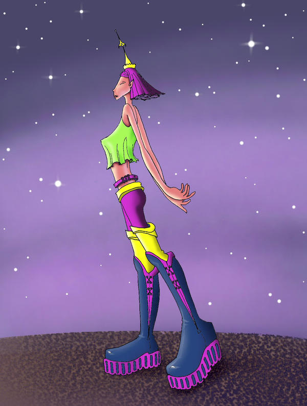
This portrait is different from the others before it in that it is the first full-body miniature I've done, but it's also the first figure I've rendered in this particular body of work that is at all stylised.  I really drew from the elongated and elegant forms of fashion illustration for this piece.  Portraying the female body as so slender and fragile is sort of something I've been fighting against, because of how women are portrayed in media and resulting body issues in girls and women, etc.  I wanted to portray average, healthy, and imperfect female bodies throughout my work up until this point.  However, for the fabric I chose and the style of this piece overall, I don't regret my choice to stylize the form.  I think it works with this piece, and I don't necessarily think that it causes an aesthetic or moral problem for me in regards to issues of body image.


I also began sewing into (finally) the second larger embroidery piece I had drawn out for the last critique, then painted over spring break.  I added "gold" leaf to it and then embroidered in a fabric with a metallic print to it, which really sets it apart from the flatness of the space princess and emulates older forms of this style of art.

dried

The piece in progress, at the point at which I had just decided I was done painting it.  Afterwards, the bleach continued to work as the piece dried.  On a positive note, the continued bleaching and the natural lightening of colours that occurs as a piece dries caused this piece to become less horrific as the red faded out.  Sadly, the continued bleaching also means that the beautiful little blue splotch in the bottom right corner disappeared.
I quite liked working on the dye paintings, and I did yet another one this week.  This one is the first one I've painted vertically, meaning I had it hanging as I worked on it.  All the others I have painted on a flat surface, usually the floor.  I wanted to further relinquish control while making this piece by allowing the dye to drip and run (although I did use the bleached muslin, which I know bleeds less than the unbleached, because I didn't want to just make a flat out mess).  I also used bleach on it, which created an interesting effect because it not only lightened the colour of the dye gradually, creating a gradient, but it also caused the dye to run and spread differently than it would on dry fabric or on fabric that was just wet from the dye.  The bleach also continued to lighten the dyes beyond the point at which I was finished working on the piece, adding another layer to my lack of control and producing results which were, at the time, unpredictable.  The colours were also, in general, more subdued than the colours I have been mixing with dye, especially, for example, her skin tone.  I also had never used green before and I'm oddly attached to it in this piece.  I think I felt it was necessary because I found the blood red of her hair quite unnerving while painting this in my bathroom, alone, in the middle of the night.


The gourd is something I've wanted to do for a long time, ever since I saw one on display at the UBC Museum of Anthropology several years ago.  I actually really wanted to travel to Peru and learn the art from an Inca, but alas, the trip to Peru is on permanent delay until my family and I are able to get used to hiking in high altitudes.  I remember seeing the gourd and feeling in awe.  The first one I saw was probably a foot in diameter and almost as high, with an incredible amount of detail carved into the bustling scene on its surface.  It was one of the most beautiful pieces of folk art I had ever seen and I knew that one day I wanted to learn how it was made or to try doing it myself.  So a couple of weeks ago, I ordered some gourds off of ebay and bought myself a woodburner.  This was something I actually hadn't thought of doing for BA, something I just sort of forgot about until I think I saw a picture of one and thought, why on earth don't I do that as part of my own work?
I have only been working with the nib that came with my woodburning tool, which is a "detail" nib, but is still quite large.  That is okay for this section, but once I get into the content, I will need finer lines.  The difficulty is that I still want the burnt lines to depress the surface of the gourd, effectively carving and burning at the same time.  I went out this afternoon and bought some additional nibs, so I should be able to get a better line quality with those.

Week 10 Inspiration & Research

This week's work was very much in the same vein as what I worked on over spring break, except for the gourd.  Most of my research and inspiration this week was dealing with content and motifs used in traditional Peruvian gourd decorating.

Source unknown; the zig zag ring around the top of the gourd is a common motif which I too used in my design.


The imagery on most gourds is either of nature or depicts Peruvian village life and celebrations.
The shapes of the frames at the top of the gourd inspired the arched frames in my own design.
The designs on the gourd's surface are usually burnt in or carved and then coloured with charcoal, but some gourds are made with a wider array of values through the use of wood stains and white enamel or carving.  I'm not sure if I will take mine this far, but it's certainly quite stunning.

While I didn't take my figure this week to quite the extremes often portrayed in sylized fashion illustrations, I did allow myself to elongate the figure rather than portray her realisitically like I usually strive to do.  


Friday, March 21, 2014

Spring Break Work


This week I spent a lot of time experimenting with natural dyes and methods of dyeing.  The first thing I tried was bundle dyeing with fresh flowers.  The top image was my first attempt, which didn't turn out as prominently as I thought it would.  When I tried it again (the bottom image), I used a much smaller piece of fabric and more flowers.  Both of these are on bleached muslin, and it occurs to me now that using unbleached muslin might achieve better, or at least different, results. 

I also tried to do a bundle dye with other natural pigments.  Here is one I laid out using turmeric, black tea, parsley, strawberries, and dark-skin grapes:
As you can see, I tried to make a face, even though I knew that a lot of the colours would bleed through and that the result would probably not be so literal after steaming.  
 I let it steam for about three hours.
Funnily enough, you can kind of see the face.  Creepy.  

Meanwhile, I had made my own liquid dyes from boiled parsley (which I unfortunately burnt, but this may have actually helped with the potency of the colour), and from padauk wood, per Russel's instructions.  My first try at using them was on a wheat-paste batik pattern:
This is on bleached muslin
 The padauk appears rather orange when it goes on, but it dries this beautiful pale red.  The padauk dye is alcohol based, which sometimes also creates some interesting effects.
Once it dried I removed the dried wheat paste and rinsed the fabric, mostly to help get some of the stubborn bits of wheat paste off of it and to soften the fabric, which becomes stiff with the dye.  The colour, however, doesn't really bleed once the dyes have dried. 

Seeing how well the wheat paste works for lines that are even quite crisp, I then tried to use it more figuratively.  It is a challenge, though, to draw with the paste, particularly because the second batch I made was thicker, and the whole I cut in my "piping bag" was a little larger and didn't let me produce very fine lines. 

Both of these are coloured with alcohol-based turmeric and padauk dyes.  

Having been somewhat dissatisfied with the results from the bundle dyes, I tried a different method of transferring flower pigments to fabric.  I instead pressed the flowers to the fabric and hit them with a hammer to release the colour.  Interestingly, the flowers I used for this piece were bright red.  I also tried a white flower out of curiosity, leaving the very subtle cream and yellow mark near the edge of the collar.  The collar itself is comprised of marks made by the hammer head against the large, flattened bell of an angel trumpet flower. I then used the padauk dye to draw a face.  Despite not having had much control over the face as I was drawing it, I actually really like how this piece turned out. 

I also continued my exploration of painting with synthetic dyes on fabric.  I again drew, or attempted to draw, the same face as before, but it turned into three completely different portraits.  (I just finished these, so they're not dry yet in these photos):
 This first one was done on bleached muslin.  I found that I have much more control on the bleached muslin verses the natural muslin because it doesn't soak through as easily.
This was on unbleached muslin that had also been rinsed and dried before I started.  It bleeds a lot more, so I was careful when I could be to not let the different colours touch too much.  What happened with the woman's hair last week was cool looking, but I'm also doing more of these to try to learn how to better control the results.  
This one is also on the unbleached muslin, but I made an effort to leave more areas not filled in with this one, and I like this one much better than the other one, as it is not quite as messy (except in the face, although her features are still discernible).

I also painted in one of the canvas drawings I showed last time.  Unfortunately, oil paint takes forever to dry so I can't sew into her yet.

Frankly just a little bit frustrated with the painting process of these fabric portraits, I decided to do another one and skip the painting all together, so it's just fabric embroidered onto a drawing on a canvas. For this one I explored a smaller scale, drawing a partial portrait on a 5x7" canvas.  This is also the first time I've used multiple fabrics in one piece (it's actually one cotton print and two types of ribbon braid).


Thursday, March 13, 2014

Week 8 Reading - In the Making: Choosing A Mission - Creating A Life - Alix Lambert (pp. 342-350)

The first thought I had while reading this essay and which kept repeating in my head as I made my way through it was that Alix Lambert is very much like an ethnographer, an anthropologist who is studying the way of life of a certain culture.  Often, ethnographers must immerse themselves in the culture they are studying, sometimes taking part in the culture's daily activities, rituals, responsibilities, simultaneously observing and recording every observance.  It is common to think that anthropologists only study "primitive" or foreign cultures, but actually, it is more common for anthropologists to study subcultures within their own cultures; for example, I read an ethnography in my anthropology class that was the result of an American anthropologist studying the drug culture in Spanish Harlem in New York city.  Lambert is doing very much the same thing; identifying a subculture, in a sense, and then studying it.  She chooses an experience that other people have had but that she herself has not had as the result of the way --in a sense the subculture--in which she was brought up, and decides to learn more about it by immersing herself in the subculture.  Each of these things had been, to a degree, foreign to her, and in recording and, more importantly, communicating what she learned, she is very much taking on the role of anthropologist.  I think the only things that might distinguish her activities from ethnographic works as works of art are a) the fact that she declares it to be art, and b) the way in which she documents her studies and presents her documentation.  For example, the way in which she chose to represent her experiences with boxing: mounting cameras on the gloves, presenting the viewer with an unprecedented perspective, but also with the disorientation of the activity and the metaphorical deterioration one experiences over a three minute round as the cameras themselves became damaged--this is a hugely creative and artistic method of representation.  The wedding photos are blown to human scale for their display, and this was an artistic choice.  In a way, the parameters she sets for herself are also artistic choices, but the time in between the proposal for each study and the presentation of the documentation of each study is more anthropology than art, not that it can't be both.
My interest in anthropology is less first hand, but I do have an interest in anthropology, and I definitely would like to bring that more into my art once I figure out other ways I can do that. I would rather use traditional art making techniques than the kind of experiential performance art Lambert incorporates into her life, but I would still like those art pieces to be a product or a result of a study of cultures with which I am not familiar.

Week 8 Work

As the paint had finally dried completely, I was able this week to finish the space princess character with cloth embroidery.  Although clothing her was a long and painstaking process, I'm quite happy with the result and am definitely interesting in doing more of this kind of work. 


I also bought some plain fabric, as I figured I would need it for something while taking the next logical steps in my sort of progression of methods for making art.  I'm not sure why I'm stuck on textiles, but right now for me it only really makes sense to work with fabrics or fabric patterns.  I did try something totally new this week, though, within this broad field of textile art, which was using fabric dye to paint directly onto fabric.  I think this was a wonderful exercise for me because it forced me to give up some control and not worry about the details too much.  While I did use a paint brush to apply concentrated dye to specific areas, it spreads how it wants to and fades when it dries, and the results are unpredictable.  That being said, I would also like to do a lot more of this technique, maybe even reproduce the same image several times and try different things in order to understand how to gain more control over it.


And here's an in progress photo, as it changed significantly as it dried. 

Week 8 Inspiration & Research


I often turn to Pinterest for inspiration because it tends to turn up more comprehensive results than a standard search engine and because that way I can save what I find and look over it all in one place later.  These were all results for "textile art"

Friday, March 7, 2014

Week 7 Reading - In the Making: Relating to the Audience - Eliciting Secrets - Gillian Wearing (pp. 110 - 118)

Gillian's work seems both incriminating in some ways, and empowering to her subjects.  On the one hand, in the video confessions for which she posted an advert, she assured participants that their identity would be obscured, which implies that their confessions would be incriminating if they were blatantly themselves.  On the other hand, in that particular piece, she invited those who were interesting in participating rather than actively recruiting people and encouraging them to participate.  In her sign series, she approaches people in public spaces and asks them to write down thoughts. It's not clear from the essay whether these people were then obligated to participate or if she would leave them alone if they declined.  It also is not clear whether she specifically told them to write confessions, or if they really could write anything they were thinking (which is how it sounds), in which case their message need not be incriminating at all.  Subjects could use this platform to communicate something completely inconsequential, but it also provided an opportunity to those who really had something to say, something bearing on them, something to protest, to get their message across.
I felt particularly attached to Wearing's statement on page 113:
Firstly they would have to agree, and on top of that they would have to think they say something that they felt.  For me this worked so much better because, when they retuned with something they had written, it challenged my own perception of them.  We all start making up our minds when we see someone; we all get ideas based on how people look, even though we know these ideas can be knocked out of us as soon as we get close to them or start talking to them.
This was particularly interesting to me because, as you might guess, this idea of how much information you can get about someone from visual cues like style of clothing, hair, posture, expression, and setting, without talking to them or getting to know them, has really been fascinating me lately.  Of course, my interpretation of this idea has been superficial; Wearing seeks specifically to undermine this opinion or perception we have of people based on these indicators.  She's particularly interested in the contrast between how a person looks and our initial perception of them and how they feel or what their inner thoughts are, the ones they try to hide outwardly.  The kinds of things they're confessing are the kinds of things that wouldn't be part of the open ended story the viewer provides when looking at an image of this person and trying to decide who they are.  On the other hand, the loose stories behind my painted ladies are driven precisely by this outward appearance, and are meant to reflect their inner stories as well.
The 2 into 1 video project really intrigued me, it just sounded so interesting and I had trouble wrapping my head around what it would be like.  I looked it up on youtube and it's just weird.  I think, though, that in a way this project is also both incriminating and empowering to its subjects.  In order to lip synch the narration so that Wearing could switch the audio on the two tracks, both groups had to be aware of what the other person was saying about the other.  I feel like perhaps, after the filming of this project, each party might be more aware of what they do that frustrates the other party, or what they do that the other party appreciates.  If I were involved in this project, I would have had a roller coaster ride in terms of self esteem.  I am surprised that for the most part, Wearing's subjects (at least those who are in the book and video) appear fairly emotionless.  I think had I had to record the audio track for someone saying nice things about me, I would be happy and embarrassed, and it would show on my face.  Similarly, if someone were criticising me in this way, I would feel embarrassed, in a bad way, sad, angry, disappointed, and might even have difficulty getting through the recording because I'd want to rebut all the negative points they had made.

Week 7 Work & Critique

This week I started a couple of larger character panels on different sized stretch canvases.  I knew I wanted stretched canvas because the intent is to sew into them after they have been painted.  So far one is just sketched out, ready to be painted, and the other one I have just finished painting.  I took into consideration the feedback directed toward the scrapbook panels last week and implied a background in this painting.  I would have liked to start sewing into it, but as I'm using oil paint, it takes a while to dry.  The first character is much more ficitionalised than the plausible characters I've been painting on the scrapbook panels.  One of the fabrics I found reminded me vaguely of space, so I drew and painted a space princess.  The other character is still fairly fictionalised because I don't mean for her to represent a specific culture or era, but she resembles the other panels more in that she is more plausible; i.e. not in space.


I would still like to finish these, but during the guest critique today there was overall less of a response to the character panels and more of a response to the original textiles and the larger painting.  Some people said they seemed more resolved because they're not set in scenes, or because less time appears to have gone into them, or maybe because they're obviously drawn.  Some suggestions I got from guests were to design more original textiles and to dry different methods of rendering them, like block printing, or painting on fabric, or having more of them manufactured (which is something I finally did with the tartan, but it didn't arrive in time for the critique); to attempt to do textile character design/wardrobe design for some male characters in order to show diversity in a portfolio with the goal of pursuing textile design for the movie and tv industry in mind; to attempt to use fabrics in different ways (which is something I will do when the work from this week dries); and to attempt another large painting like the one I've been working on (which I would like to do and have a canvas for already, but don't know what the scene or subject would be).  Suggestions from the curatorial class were to focus on some things that were more personal to me, like heritage and family, because the tartan and the painting were perceived as rather strong.  Another suggestion was to design more plaid, although now that I've finished the one for my family I don't know what else I would design for.


Week 7 Inspiration & Research

Last week I went to a quilting store because I wanted to work fabric further into these character portraits I've been doing.  The nature of the project is that the inspiration is external; the inspiration comes from the textile I choose.  In general, I try not to do much research about historical or cultural patterns because once I have an idea of who this character might be, I don't really want to be influenced any further. I think I have decided that although these characters bear some resemblance to cultures in our world, and obviously the textiles I'm finding have been generated within this world, the characters are more or less fantastical.
I've been working with a couple of textiles this week as the basis for the two portraits I have started:


However, with the first one, there were a couple points at which I did get a little bit stuck and needed some outside sources of inspiration.  Although this ended up having little influence on my character, I was really drawn to this caricature for some reason.  I liked the elongated figure and the angular face.  I'm not sure if this is something I might venture into (I quite like the idea of doing fashion catalogue/pattern-style portraits).  I think I was also feeling that even though this was a fantastical character, I wanted her to be plausible, and I was doubting her costume design.  Looking at this piece helped me realise that her dress was perfectly acceptable and not too over the top.


I also reached a bit of a block when I had finished painting my figure and moved on to the background.  I wanted to imply some kind of environment but not have it rendered in any detail or detract from her appearance and prominence.  This piece by Frank Frazetta actually helped, mostly through its demonstration of atmospheric perspective as a way to mitigate the dominance of the background.